Fly UX Air: Academic Case
ROLE
UX research and designer | June - December 2022
OVERVIEW
This is an academic case study while I was attending the UX Design Course facilitated by The UX Design Institute. The end goal of this project was to design and build a clickable prototype that can be tested with users and handed over to developers.


Challenge
My client is a start-up airline and they were looking to create an online experience that is fast, easy and intuitive.
Many users drop off during the flight booking process before they come to completing their purchase. My challenge is to help my client to increase conversions by providing users an experience that's based on a deep understanding of their goals, behaviours, and context.
Research Techniques
I started the research phase of this project with an Online Survey and Competitive Benchmark. I then followed these techniques with Usability Tests and Deep Interviews.
I set the following goals for my research phase and used these four techniques to help me achieve these goals.
-
Learn about the goals and context of people that use websites in the airline industry
-
Learn about pain points users experience on other websites within the airline industry
-
Learn how best-in-class websites solve the problems we are currently trying to solve
-
Understand the conventions we should follow
-
Highlight best practices that we should emulate
-
Learn about the context of use of people that use airline websites
-
Learn more about the goals and behaviours of customers when booking flights

Online Survey
The weight of numbers made the online survey a powerful tool for my research during this project. I gathered both quantitative data from structured questions and qualitative data from a number of unstructured questions.
I left the Online Survey open to both platforms, Desktop and Mobile, to allow users the opportunity to express the platform that they use most frequently and what problems they may encounter that I could solve.
Online Survey Findings
-
The majority of participants use Desktop to book their flight tickets (66.7%)
-
Ticket price is the most important decision factor when purchasing flight tickets (88.9%)
-
Comparing flight prices and booking tickets are the top reasons participants visit airline websites
Competitive Benchmarking
I researched competitors' websites looking for:
-
How best-in class websites solve the booking process problem?
-
What these websites are doing well that I can emulate?
-
What areas they are not doing well so that I could improve on these areas?
-
What conventions have been established that I could follow?
Competitive Benchmarking Selection
-
EasyJet - A popular low-cost air carrier that operates throughout Europe.
-
KLM Royal Dutch Airlines - National air carrier in the Netherlands, which is the country I am based in.
-
Lift - A South African based airline that is relatively new to the market. As a South African, I am familiar with the airlines that operate in South Africa.


Usability Test & Depth Interview
At this point I made the decision to focus on creating a booking solution for desktop. I performed usability tests and depth interviews to gather further relevant data by observing users and understanding their goals, behaviours, and context of use when going through the process of booking a flight with popular airline.
Usability Test and Depth Interview Findings
-
The display of information is busy and overwhelming
-
Useful features are not clear to users so they are not used
-
Users expect some level of personalisation i.e. their current location to be pre-filled at the departure location
Analysis Techniques
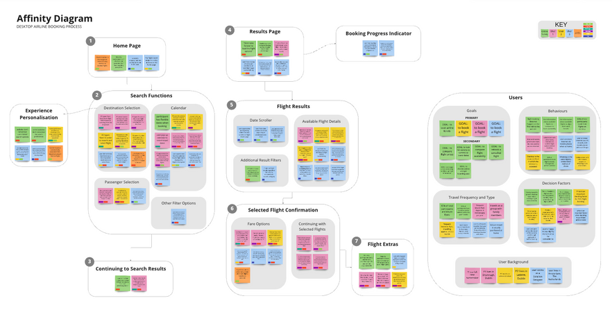
I used an Affinity Diagram and a Customer Journey Map to analyse the data gathered from my research.
An Affinity Diagram is by far the best way to organise the unstructured data I had gathered. Not only is it a fast technique but it offers a high-quality output. I used Miro to create a digital whiteboard of post-it notes for my Affinity Diagram.
I then created a Customer Journey Map to visualise what the customer experiences as they interact with the flight booking software. The Customer Journey Map helped me to see things through the eyes of the users and it highlighted the aspects of the journey that needed to be optimised as a priority.
User Flow Concept
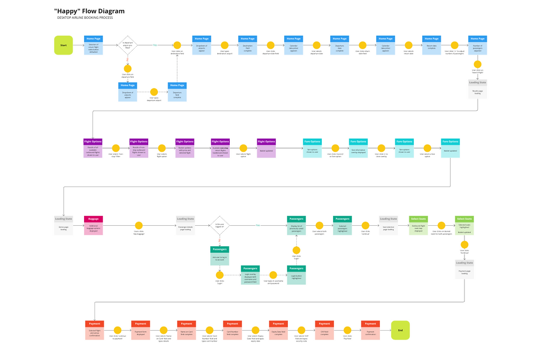
Before getting stuck into wireframes, I considered the "Happy" flow of a user through the booking process I was designing.
I started by sketching a flow with pen and paper. I then used this as a reference to create a user flow on Miro, but before finalising the design of the "Happy" flow, I sought to:
-
understand where each screen sits within the structure defined in the Information Architecture
-
understand the "Happy" flow's sequence within the most common use case flow
-
understand the different screen states as the user would flow through the booking process
-
include software decision points and how this would impact the screen states within the user flow

Interactive Design Sketches
I started with rough sketches of screens in the booking process on loose pieces of paper.
I then moved on to sketching out each screen state using my rough sketches as reference for the final sketches.
It was at this point that I defined a navigation style that is suitable for the flow of the booking process. The booking process is a linear sequence of actions and results and therefore a Horizontal Navigation would be suited for the home screen and this would change to a Navigation Drawer as the user moves through the booking process. The Navigation Drawer will help avoid user distractions through the booking process on desktop.


High Fidelity Prototyping
My academic case study called for at least a medium fidelity prototype but I decided to challenge myself and create a high fidelity prototype that I could use in a usability test with a user.
Creating a high-fidelity prototype allowed me to:
-
assess the booking flow efficiency and the sequence of screens
-
assess the effectiveness of screen layout and hierarchy
-
assess if navigation structure and terminology make sense to users
-
assess the effectiveness of copy and labelling
-
assess the performance of my form design

Handover
Once I had completed the high-fidelity prototype and tested it with a user I annotated the design in preparation to hand it over to developers.
My annotations focus on the importance of communicating how the design works. The annotations address:
-
how the design functions and the rules that apply the elements
-
what happens to other elements upon interaction
-
errors that occur and the feedback on these errors


